Choosing the right exterior paint colour is a significant decision. You hold a small swatch in your hand, trying to imagine it across your entire home. Will it look too dark? Will that subtle grey suddenly appear blue or even purple in the bright Brisbane sun? It’s a common worry, and one that can make a simple choice feel overwhelming. This is especially true for a complex, popular colour like Dulux Tranquil Retreat.
As professional painters with decades of experience, we’ve seen how this beautiful colour behaves in the real world. In this comprehensive review, we cut through the confusion. We’ll reveal its true undertones, show you how it looks on a local home’s exterior, and provide practical, reliable advice on the best complementary colours for your roof, trims, and doors. By the end, you’ll feel confident knowing exactly what to expect from this timeless and versatile grey, ensuring a quality result you’ll love for years to come.
What Colour is Dulux Tranquil Retreat, Really? Unpacking the Undertones
Choosing the right exterior paint colour can feel overwhelming, but understanding the nuances of a shade like Dulux Tranquil Retreat makes the decision much easier. While often categorised as a simple grey, it’s far more complex and versatile. At its core, Tranquil Retreat is a soft, neutral ‘greige’-a sophisticated blend of grey and beige. This combination gives it a unique chameleon-like quality, allowing it to adapt beautifully to its surroundings.
For a detailed visual breakdown of this colour, the following video provides an excellent overview:
The defining characteristic of this colour is its subtle green-grey undertone. This hint of green is what gives it a calming, earthy feel, connecting your home’s exterior to the natural landscape. To get technical, Dulux Tranquil Retreat has a Light Reflectance Value (LRV) of 48. LRV measures how much light a colour reflects, with 0 being black and 100 being pure white. An LRV of 48 places it perfectly in the mid-range, meaning it’s substantial enough to hold its own in bright sun without looking washed out, yet light enough to avoid appearing too dark or heavy on overcast days.
Warm vs. Cool: The Verdict
Tranquil Retreat is a beautifully balanced mid-tone grey that leans slightly warm. This subtle warmth is crucial, as it prevents the colour from feeling sterile or cold-a common concern with exterior greys. Its versatility makes it a reliable choice for both modern architectural designs and more traditional homes. The way it appears can shift with the light; in shaded, south-facing areas it may read as a cooler, more classic grey, while in direct afternoon sun, its warmer beige and green undertones become more apparent. Understanding how light interacts with paint is a core part of professional painting, rooted in well-established color theory principles.
Tranquil Retreat vs. Other Popular Dulux Greys
Placing a colour in context is one of the best ways to understand it. Here’s how Tranquil Retreat compares to other popular greys Australian homeowners often consider:
- Miller Mood: Often seen as a close relative, Miller Mood is typically a shade darker and can present slightly warmer, with a touch more beige in its composition.
- Dieskau: In contrast, Dieskau is a cooler, more traditional grey. It lacks the prominent green/beige undertones of Tranquil Retreat, giving it a crisper, more architectural feel.
- Colorbond® Shale Grey™: While Shale Grey™ is a popular choice for roofing and sheds, it is a lighter, more straightforward grey. Tranquil Retreat offers more depth and organic softness, making it a more nuanced choice for walls and weatherboards.
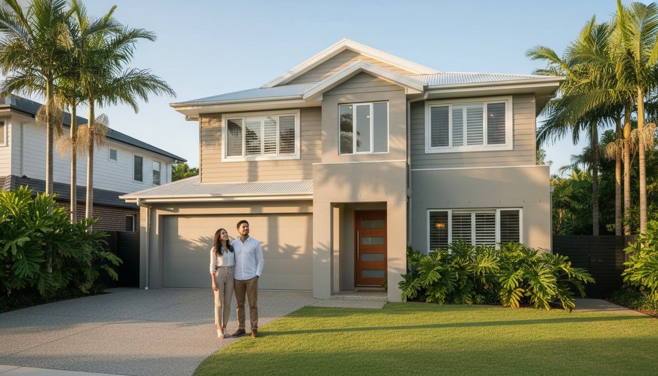
Using Tranquil Retreat on Your Brisbane Home’s Exterior
Choosing an exterior colour in Brisbane requires careful consideration of our unique light and climate. A colour that looks perfect on a swatch can appear completely different under the intense Queensland sun. This is where Dulux Tranquil Retreat truly excels, offering a sophisticated and reliable choice for local homes, from classic Queenslanders to contemporary new builds.
One of the most important things to note is how our bright, direct sunlight affects this colour. Expect Tranquil Retreat to appear a shade or two lighter and slightly less grey on an exterior wall than it does indoors. This quality gives it a soft, welcoming warmth, preventing it from looking cold or stark while still maintaining a modern, neutral feel.
Best Exterior Surfaces for Tranquil Retreat
The versatility of Dulux Tranquil Retreat makes it a premium choice for a wide range of materials and applications. As professional painters with decades of experience, we’ve seen it deliver exceptional results on many surfaces, including:
- Render and Stucco: On rendered walls, it creates a soft, contemporary, and sophisticated look. The subtle warmth taps into the calming aspects of color psychology, making a home feel instantly inviting.
- Weatherboards: It’s the perfect main colour for achieving a modern Hamptons or coastal-inspired aesthetic, pairing beautifully with crisp white trims.
- Trims and Fascia: Used on trims, eaves, or fascia boards, it provides a gentle alternative to a stark white, offering a softer and more refined contrast against darker main colours.
- Fences and Garages: Painting fences or a garage door in Tranquil Retreat helps create a cohesive and polished look that seamlessly connects your entire property.
How Does It Hold Up in the Queensland Climate?
A beautiful finish is only worthwhile if it lasts. The durability of an exterior paint job comes down to two key factors: quality products and thorough preparation. When applied correctly using a premium product like Dulux Weathershield, Tranquil Retreat offers excellent performance against Brisbane’s harsh conditions. Its mid-tone depth is also a practical advantage, as it resists showing dirt and water marks far better than pure whites, keeping your home looking cleaner for longer.
Tranquil Retreat as a Roof Colour
While often used for walls, Tranquil Retreat is also an outstanding choice for a roof restoration. It provides a modern, light-to-mid grey finish that is a stylish alternative to the more common dark grey or charcoal roofs. In the Queensland climate, a lighter roof colour can help reflect more solar radiation, potentially contributing to a cooler home and improved energy efficiency. For a durable, long-lasting result, a roof application should always be undertaken by experienced professionals who can ensure the surface is prepared correctly and a high-quality roof membrane is used.
The Best Colour Pairings: What Goes with Tranquil Retreat?
Choosing your main exterior colour is a significant first step, but the true artistry lies in selecting the supporting palette. A well-planned colour scheme ensures a professional, cohesive finish that elevates your home’s entire look. The beauty of Dulux Tranquil Retreat is its incredible versatility, allowing it to pair beautifully with a range of whites, deep tones, and natural materials to create a truly timeless exterior.
Perfect Whites for Trims and Ceilings
The white you choose for your trims, fascias, and eaves has a major impact on the final feel of your home. It frames the main colour and can either sharpen its features or soften its edges. Getting this detail right is a mark of quality craftsmanship.
- For a Crisp, Modern Contrast: We recommend Dulux Lexicon® Quarter. This clean, crisp white creates a sharp definition against Tranquil Retreat, making it an excellent choice for contemporary or Hamptons-style homes.
- For a Softer, Seamless Feel: If you prefer a warmer, more integrated look, Dulux Natural White™ is the perfect partner. Its subtle warmth complements the grey-green undertones of Tranquil Retreat for a harmonious and inviting finish.
Complementary Colours for Doors and Features
An accent colour on your front door or other architectural features is a fantastic way to add character and street appeal. With a sophisticated neutral like Dulux Tranquil Retreat as your base, you have several high-impact options.
- Dark Charcoal: For a bold and dramatic statement, you can’t go past a deep charcoal. A front door painted in Dulux Monument® or Domino provides a strong, grounding contrast.
- Deep Greens: To lean into the green undertones, consider a feature door in a rich, earthy green like Dulux Teahouse. This creates a sophisticated, nature-inspired palette.
- Natural Timber: Don’t overlook the power of natural materials. The warmth of a timber deck, garage door, or entryway accent works beautifully with this colour, adding organic texture and warmth.
Coordinating Roof and Gutter Colours
Connecting your exterior walls to your roof is essential for a professional and thoughtfully designed home. Your roof and gutter colours should complement your wall colour, not compete with it. We frequently recommend trusted Colorbond® options for their durability and style.
- For a Classic, Strong Contrast: Colorbond® Monument® or Woodland Grey® are classic choices that create a strong, defined roofline and anchor the entire scheme.
- For a Subtle, Tone-on-Tone Scheme: For a softer, more contemporary look, Colorbond® Shale Grey™ coordinates beautifully, creating a subtle and elegant tonal variation.
Visualising how these combinations will look on your property can be challenging. To make a confident decision and ensure a flawless result, why not get a professional colour consultation?

A Painter’s Guide to Getting the Perfect Finish
Choosing a beautiful colour is the first step, but achieving that picture-perfect finish requires professional technique and meticulous attention to detail. As accredited master painters, we know that the quality of the application is just as crucial as the colour choice itself. This guide moves beyond theory to the practical steps that ensure a stunning and durable result for your home’s exterior.
The Golden Rule: Always Test a Sample Pot
Before you commit to painting your entire home, it’s essential to see how the colour behaves in its intended environment. We always advise painting a large sample, at least A4 size, on a couple of different walls-one that gets full sun and one that’s often in shade. Observe how Dulux Tranquil Retreat looks in the bright morning light, under the direct midday sun, and in the warm glow of the late afternoon. Its sophisticated undertones can shift dramatically, and a sample pot is the only way to be certain you’ll love the final result.
Choosing the Right Sheen Level
The sheen, or finish, of your paint impacts both its appearance and its durability. For a high-quality, long-lasting exterior, we recommend using a combination of finishes for different surfaces:
- Low Sheen: This is the standard and best choice for most exterior walls. It provides a subtle, elegant finish with excellent durability and is easy to keep clean.
- Semi-Gloss: Ideal for trims, window frames, gutters, and doors. Its higher sheen offers superior resistance to scuffs, dirt, and moisture, making it exceptionally tough and easy to wash.
- Matt Finish: While offering a very modern, non-reflective look, a matt finish is generally less durable for high-traffic or exposed exterior surfaces and can be more difficult to clean.
Why Surface Preparation is Non-Negotiable
This is the single biggest factor that separates a DIY attempt from a professional paint job. No paint, no matter how premium, will look good or last long on a poorly prepared surface. A beautiful colour like Dulux Tranquil Retreat deserves a flawless canvas to truly shine. Professional preparation is a thorough process that involves high-pressure cleaning to remove dirt and grime, sanding away imperfections, and applying the correct primer. This ensures the paint adheres perfectly and delivers a smooth, uniform finish that stands the test of time.
Skipping these critical steps often leads to peeling, blistering, and a finish that ultimately detracts from your home’s value. To ensure your investment is protected and your home looks its absolute best for years to come, trust the experts. If you’re looking for a professional finish you can rely on, contact the team at Brisbane Roof & Paint for an obligation-free quote.
Transform Your Home with the Versatility of Tranquil Retreat
As we’ve explored, Dulux Tranquil Retreat is a truly sophisticated and versatile choice for any home. Its complex grey-green undertones allow it to adapt beautifully to different lighting conditions, making it an exceptional option for Brisbane exteriors. However, achieving its signature calm and elegant look depends on thoughtful colour pairings and meticulous application. Ultimately, the success of dulux tranquil retreat lies in the quality of the finish.
Choosing the right colour is the first step; ensuring it’s applied perfectly is what brings your vision to life. As a family-owned and operated Brisbane business with over 35 years of experience, our team of Accredited Master Painters is committed to delivering a flawless, long-lasting result you can rely on. Ready to transform your home with a professional finish? Contact Brisbane Roof & Paint for a free, no-obligation quote. We look forward to helping you create a home you’ll love for years to come.
Frequently Asked Questions About Dulux Tranquil Retreat
Is Dulux Tranquil Retreat a warm or cool grey?
Dulux Tranquil Retreat is definitively a cool-toned grey. It features distinct cool undertones that give it a crisp, modern, and sophisticated appearance. This makes it an excellent choice for creating a serene and calming atmosphere. It pairs beautifully with brilliant whites like Dulux Lexicon® Quarter for trims and ceilings, which helps to emphasise its cool character and create a clean, contemporary look for your home’s exterior or interior spaces.
What Colorbond colour is the closest match to Tranquil Retreat?
The closest and most recommended Colorbond® match for Tranquil Retreat is Shale Grey™. Both colours share a similar light, cool grey profile, making them an extremely popular and harmonious pairing for modern Australian homes. Using Tranquil Retreat on walls or weatherboards alongside a Shale Grey™ roof, guttering, or garage door creates a seamless and professionally designed exterior palette. For those looking for a new garage door in this popular shade, online specialists like Door Supply offer custom-made Colorbond® options, ensuring a perfect match and excellent kerb appeal.
Will Tranquil Retreat make my room look dark?
Tranquil Retreat is a mid-tone grey, so its effect on a room depends heavily on natural light. In a space with ample sunlight, it will appear light, airy, and refreshing. However, in a darker room with limited windows or poor lighting, it can feel more enclosed and moody. We always recommend purchasing a sample pot and painting a large swatch on your wall to observe how the colour changes throughout the day in your specific lighting conditions.
What is the difference between Tranquil Retreat and Dulux Miller Mood?
While both are popular greys, the main difference lies in their undertones and depth. Tranquil Retreat is a lighter, cooler grey with a noticeable soft green undertone. In contrast, Dulux Miller Mood is a slightly darker and more complex ‘greige’. It often presents as a warmer, more neutral grey and can show subtle brown or taupe undertones, giving it a moodier and earthier feel compared to the crispness of Tranquil Retreat.
Is Tranquil Retreat a good colour for interior walls?
Yes, Dulux Tranquil Retreat is an exceptionally popular and versatile choice for interior walls. Its soft, cool neutrality provides a sophisticated backdrop that complements a wide range of design styles, from modern and minimalist to coastal and Hamptons. It creates a calm and restful feeling in living rooms, bedrooms, and studies, and it works beautifully with both timber flooring and neutral carpets, allowing your furniture and artwork to stand out.
Does Tranquil Retreat have a blue, green or purple undertone?
The most prominent undertone in Tranquil Retreat is green. This soft green base is what gives the colour its signature serene and calming quality. While different lighting conditions can sometimes influence how a colour is perceived, it will reliably lean green. It does not typically show any purple undertones. In some cool, south-facing light, it may appear to have a slight blue-green hint, but its primary characteristic remains a gentle green.